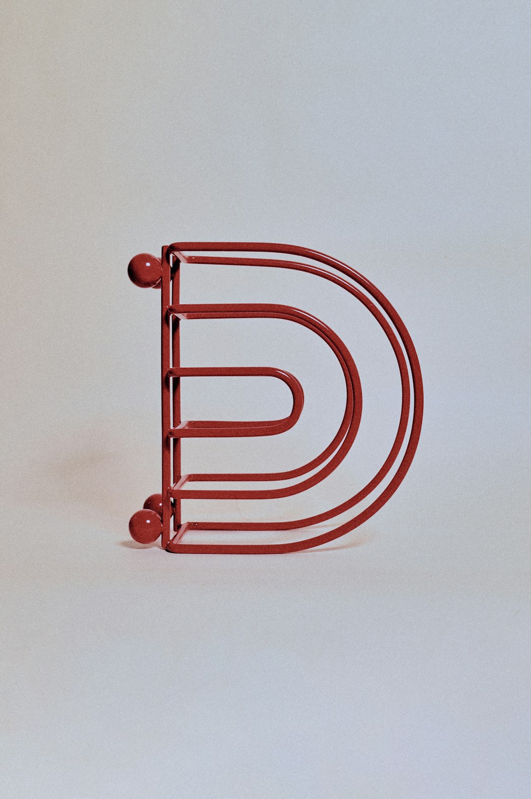
Whether you’re opening a brand-new fitness studio or giving your gym a fresh new look, your logo matters a lot. It’s like a flexing bicep — it shows off your brand’s strength and style. But designing a logo can feel like lifting a really heavy barbell for the first time. Let’s make it lighter, easier, and even fun.
TLDR: Looking for logo ideas for your gym or fitness studio? This article shares 8 fun and easy concepts to get your creative juices (and maybe biceps) flowing! From minimalist dumbbells to fierce animal icons, find the style that fits your vibe. Spoiler alert: muscles and creativity make a great duo!
1. The Minimal Muscle
Clean. Simple. Strong. These logos keep it cool with just a dumbbell or a barbell icon and your gym name in a clean font. Nothing extra, just pure strength in design.
- Great for: Boutique fitness studios and personal trainers.
- Why it works: Easy to recognize and looks professional anywhere — T-shirts, water bottles, or a website banner.
Tip: Try black and white or one bold color like red or electric blue to make it pop.
2. Beast Mode Icons
Want your gym logo to scream power? Use a strong animal image like a lion, gorilla, or bull. These logos grab attention and make it clear — your gym is all about beast-mode energy.
- Great for: High-intensity training gyms, strength facilities, or CrossFit boxes.
- Why it works: Animals symbolize raw power. That energy speaks before you say a word.
Tip: Combine the animal with a fitness symbol like a barbell for extra impact.
3. Retro Vibes
Bring the ’80s and ’90s back with a neon-tinged or vintage style logo. Think chrome lettering, lightning bolts, and headbands.
- Great for: Studios with a fun or nostalgic brand personality.
- Why it works: It stands out and adds a playful energy to your gym’s look.

Tip: Use script fonts and bold colors like pink, purple, and teal.
4. Lettermark Power
Sometimes, less is more. A simple lettermark — using one or two initials — can make your logo sharp and stylish. Think “FG” for “Flex Gym.”
- Great for: High-end gyms or fitness brands wanting a sleek look.
- Why it works: It’s flexible for social media icons and branding gear.
Tip: Choose bold, sans-serif fonts and clean lines. Add a small fitness icon or underline to top it off.
5. The Human Form
Use the shape of a body in motion — a flexing arm, a running figure, or someone lifting weights. These help people instantly understand what your gym is about.
- Great for: General gyms or training studios that focus on movement and personal performance.
- Why it works: Movement is dynamic, and logos that show action feel alive and energetic.
Tip: Silhouettes and line art versions keep it artistic and modern.
6. Location-Inspired Designs
If your city or neighborhood has a unique vibe, add it to your logo! A mountain background, urban skyline, palm tree, or desert sun can make your gym stand out and feel local.
- Great for: Community-based gyms or regional fitness studios.
- Why it works: It creates a sense of belonging and pride for locals.
Tip: Combine the local icon with a kettlebell or dumbbell for a perfect matchup.
7. Badge-Style Logos
These are round or shield-shaped logos that feel strong and official — like a seal of approval for hard work. They usually include your gym name, year founded, and icons like stars, weights, or flames.
- Great for: Hardcore, results-driven gyms or old-school boxing studios.
- Why it works: It creates a sense of tradition and toughness.
Tip: Use bold fonts and symmetrical designs to keep it clean and memorable.
8. Playful and Bold
If your gym is all about fun workouts and high energy (like dance fitness or HIIT game-style classes), use fun colors and quirky icons. Think bouncing kettlebells, smiley faces with sweatbands, or catchy taglines.
- Great for: Younger audiences or studios that love a positive, energetic vibe.
- Why it works: It feels fresh and inviting, not intimidating.
Tip: Go wild with colors but stick to 2–3 max so it’s not overwhelming.
Pro Tips for Any Logo
Now that you know the styles, here are some bonus lifts to take your logo to the next level:
- Test in black and white – If it doesn’t look good without color, it might not be strong enough.
- Keep it scalable – Your logo should look amazing on a billboard AND a protein shaker.
- Make it unique – Try not to borrow too closely from others. You want to lead, not follow.
- Ask for feedback – Show your logo design to real people who’d join your gym!
Time to Get Sweaty with Your Logo!
Creating a gym or fitness logo doesn’t have to be a tough workout. With these 8 ideas, you’ve got plenty of options to explore. So flex those design muscles and build something that makes people want to move, lift, stretch—and most of all—join your gym.
Whether you lean into sleek letters or go full beast mode with fierce icons, your logo should represent you. Make it strong. Make it memorable. Make it yours.
Now go create some logo gains!

